 |
|
Reviews, updates and in depth guides to your favourite mobile games - AppGamer.com
|
|
CD packaging work |
|
| Page: 1 2 | Reply |
| Jun 7th 2005 | #168621 Report |
 Posts: 23 |
Hi there ! Here is my latest CD packaging design . The box includes 9 music and two video CDs . This work is non-commercial and dedicated to some of my friends . All the ornaments were drawn by hand and then scanned . Comments and critiques are highly appreciated . Thanks ! Front-Side: 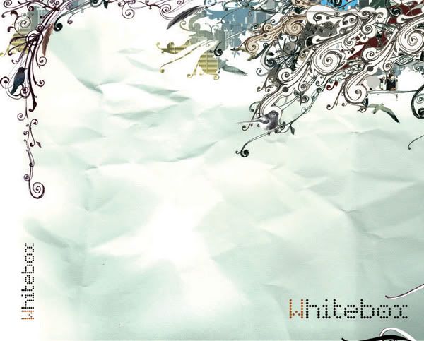 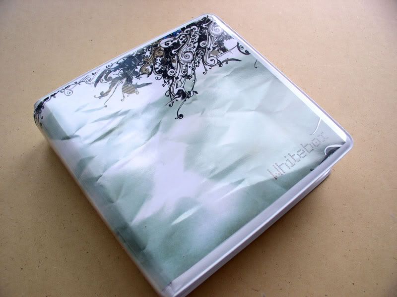 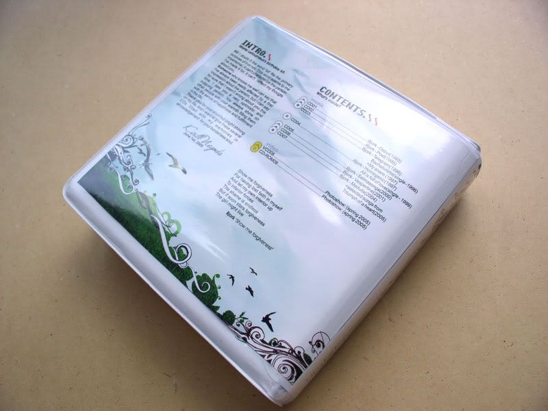 Front detailed: 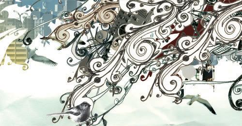 Back detailed: 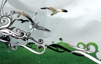 |
| Reply with Quote Reply | |
| Jun 7th 2005 | #168623 Report |
|
Posts: 1604 |
this is actually really nice, i like it. the wrinkled paper scan gives it a cool feel. nice work. chris |
| Reply with Quote Reply | |
| Jun 8th 2005 | #168637 Report |
|
Posts: 1977 |
Nice! Though im not a fan of the wrinkled paper, alteast on the front cover. First, it gives me the feeling of a product in bad condition. The effect is too much...I think if the contrast was lowered a bit it might look better. Also before I think about the design, im already expecting a smooth plastic case, so there's a kinda conflict between what I see and what I want to see. Second, the wrinkles are horizontal and your elements are aligned vertically. They kinda distract me and lead my eye away from the actual graphics. Again if the contrast was lowered, this effect would be less and would put more emphasis on the other images. I love the back cover though! You have less contrast here, which makes it look a lot better (not to mention easier to read). You also have a nice balance and the right amount of eye candy (not enough to distract, but enough to keep a persons attention). Plus that little bit of color goes a long way. There's really nothing I would change here. Maybe the backslashes if anything. Overall though nice work!!! |
| Reply with Quote Reply | |
| Jun 8th 2005 | #168644 Report |
|
Posts: 23 |
.Now i see the background at the front needs to be changed at all. Thanks for your comments and help 
|
| Reply with Quote Reply | |
| Jun 8th 2005 | #168647 Report |
|
Posts: 672 |
Beautiful work man, I love the illustration. If you wouldn't have mentioned it, I'd think this was done in Illustrator :D Great design |
| Reply with Quote Reply | |
| Jun 8th 2005 | #168651 Report |
|
Posts: 23 |
[QUOTE=OnCleSAm].. If you wouldn't have mentioned it, I'd think this was done in Illustrator..[/QUOTE] i drew random elements first and arranged them in photoshop . |
| Reply with Quote Reply | |
| Jun 9th 2005 | #168674 Report |
|
Posts: 436 |
Wow - Looks really good. Love the drawing. I would agree that the front wrinkles are a bit much - but who knows, it may look better in the flesh so to speak.
|
| Reply with Quote Reply | |
| Jun 11th 2005 | #168724 Report |
|
Posts: 23 |
Thanks for all the comments and some help! I lowered the contrast of the paper on the bg and shaded it with warm colors. Now it looks much better
|
| Reply with Quote Reply | |
| Jun 11th 2005 | #168727 Report |
|
Posts: 27 |
in my personal opinion i do not like the paper effect - concept is a work in progress but then again that is my opinion. also reminds me to much of a Beck album cover. originality is lost to me.
|
| Reply with Quote Reply | |
| Jun 11th 2005 | #168730 Report |
|
Posts: 23 |
[QUOTE=rogas]also reminds me to much of a Beck album cover. originality is lost to me.[/QUOTE] i'm confused , you can take any work , compare it with another and say that it isn't original :confused: btw i have all the beck's albums and i don't think his colourful acid-pop style doesn't have something in common with my black and white graphics. But if u think my home-made cover is good enough to compare it with professional one , i appreciate that :rolleyes: |
| Reply with Quote Reply | |
| Page: 1 2 | Back to top |
| Please login or register above to post in this forum |
| © Web Media Network Limited. All rights reserved. No part of this website may be reproduced without written permission. Photoshop is a registered trademark of Adobe Inc.. TeamPhotoshop.com is not associated in any way with Adobe, nor is an offical Photoshop website. |